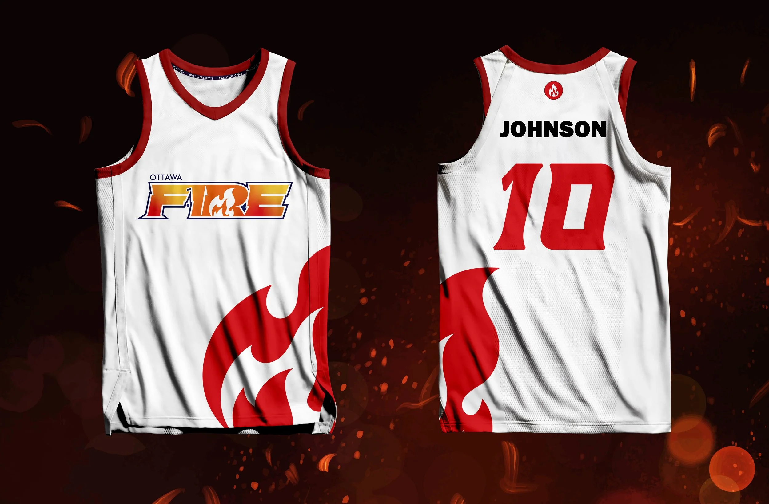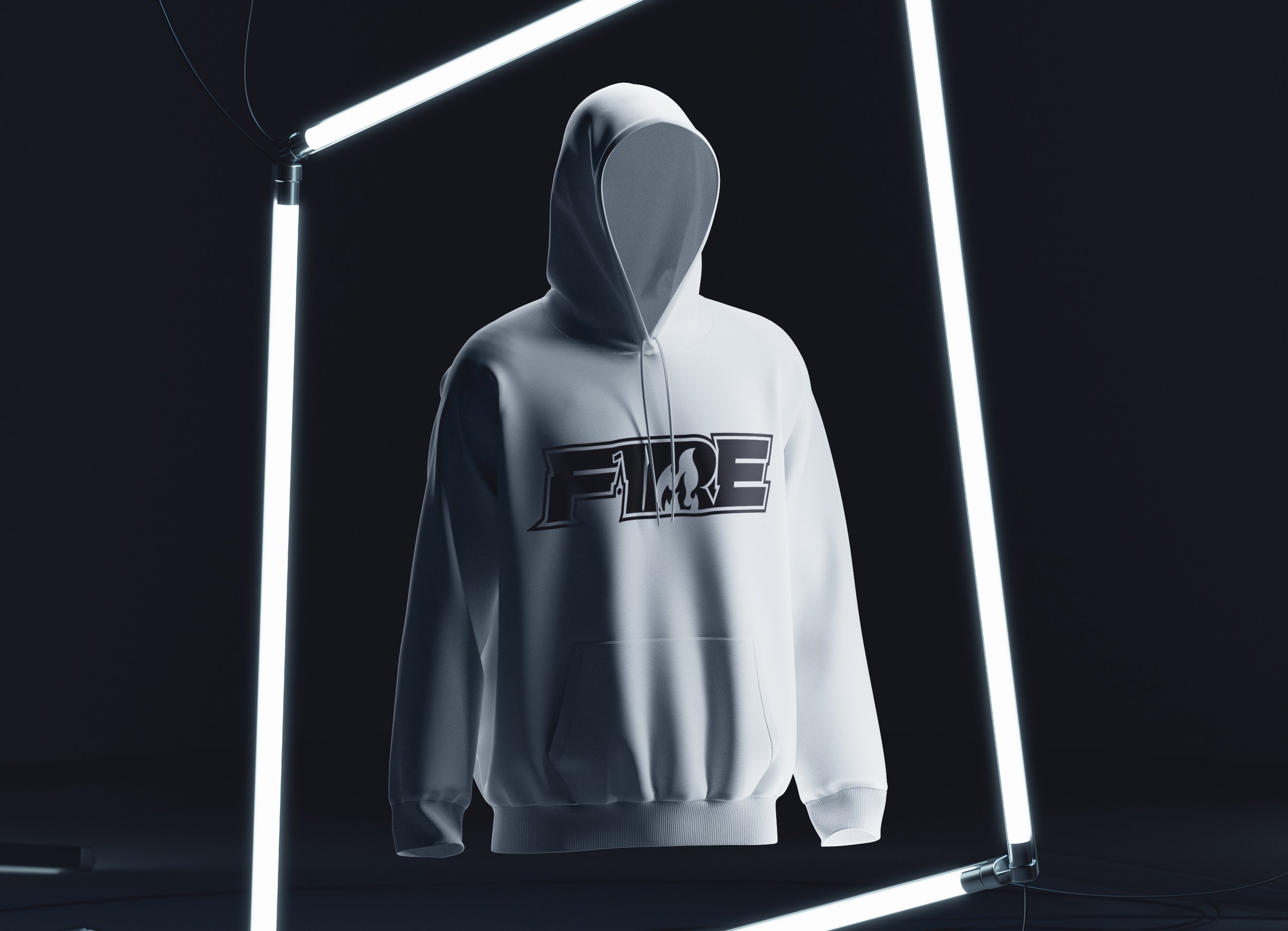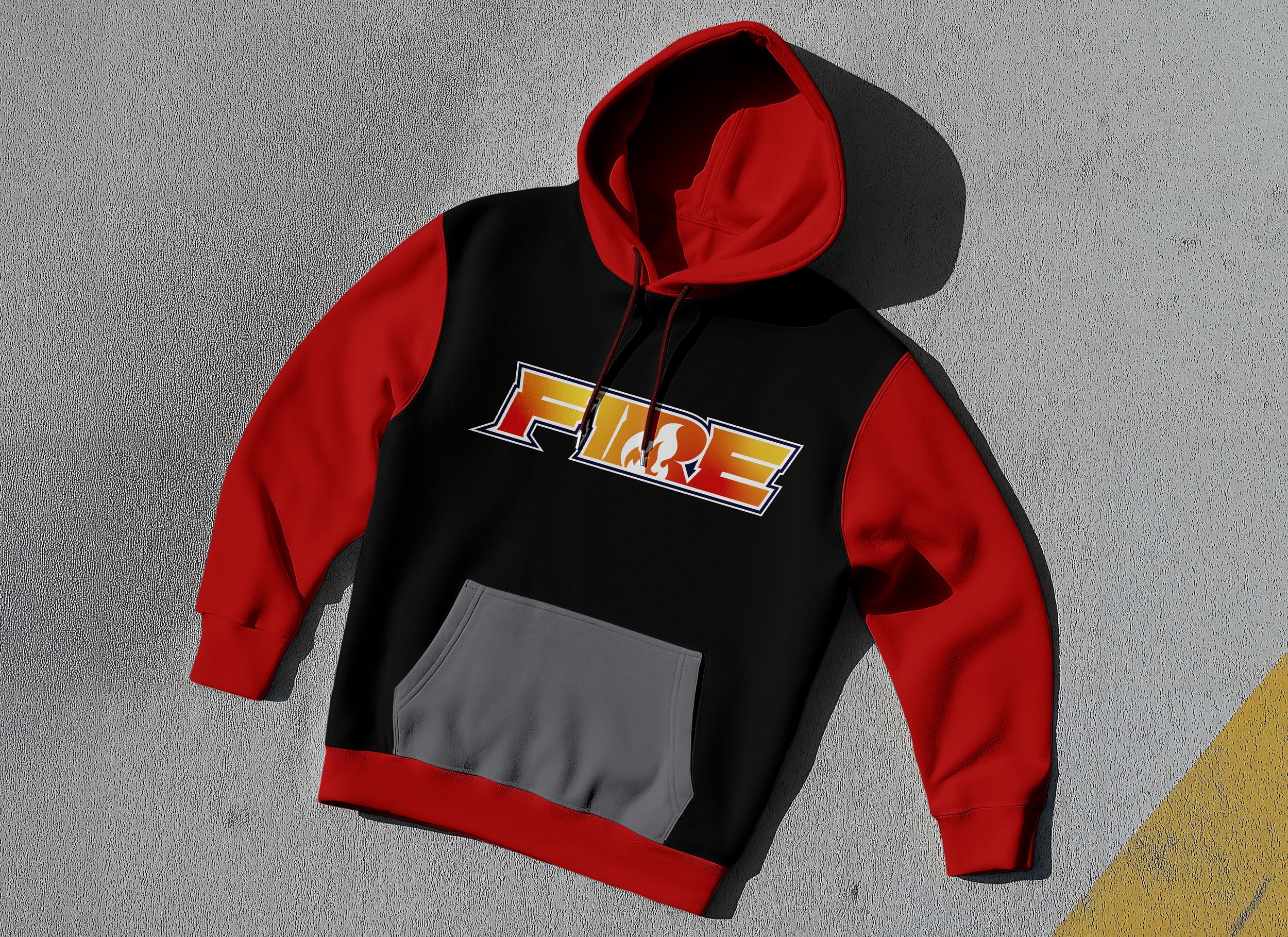
Ottawa Fire (OJCUP)
Services provided: Logo design, ongoing brand support.
The Mission…
The Ottawa Junior Competitive Ultimate Program (OJCUP) approached me to totally revamp the branding for their competitive team as they were not satisfied with internal options that were available to them.
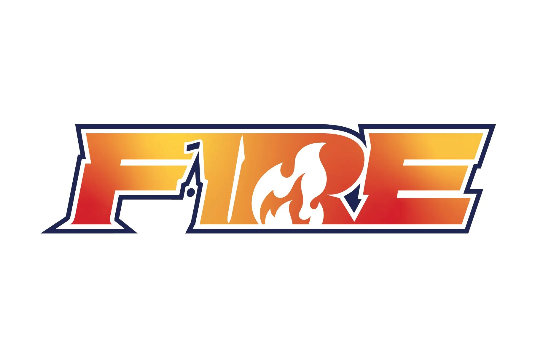
After a briefing meeting with stakeholders, they required the four colours of their developmental team (Blue, Red, Orange, Gold) be include in the design. A tough ask for any designer. Another must-have was the inclusion of the Peace Tower in the design to link it back to their competitive female team. They also wanted a logo that showed the power and athleticism the sport of ultimate is known for.
After several icon concepts, I settled on developing a wordmark logo to use across the chest of their jerseys. Adding the Peace Tower as a fun task. The initial suggestion from stakeholders was to turn the “I” into the Peace Tower for easy recognition. After a few attempts at this, I found that idea overwhelmed the design and lead to an unbalanced look. I decided to take a different approach and see how the Peace Tower could fit into the negative space after realizing the “gashes” the font provided a unique opportunity. After a few attempts, the space between the “F'“ and the “I” was the natural spot and I designed the Peace Tower around that. The biggest challenge was incorporating all four colours into the design without it giving a “circus tent” feeling. My solution to this was to create a custom freeform grant, not only to incorporate three of the four colours in a single plain, but also to add something else to the flame motif other than the negative space in the “R”. Adding a solid navy blue around the design kept everything contained a balanced the design, while also adding that fourth colour that was important to the stakeholders.